Content cards
This section lets you create sets of cards with text content and images, displaying them as either a scrollbar or slider.
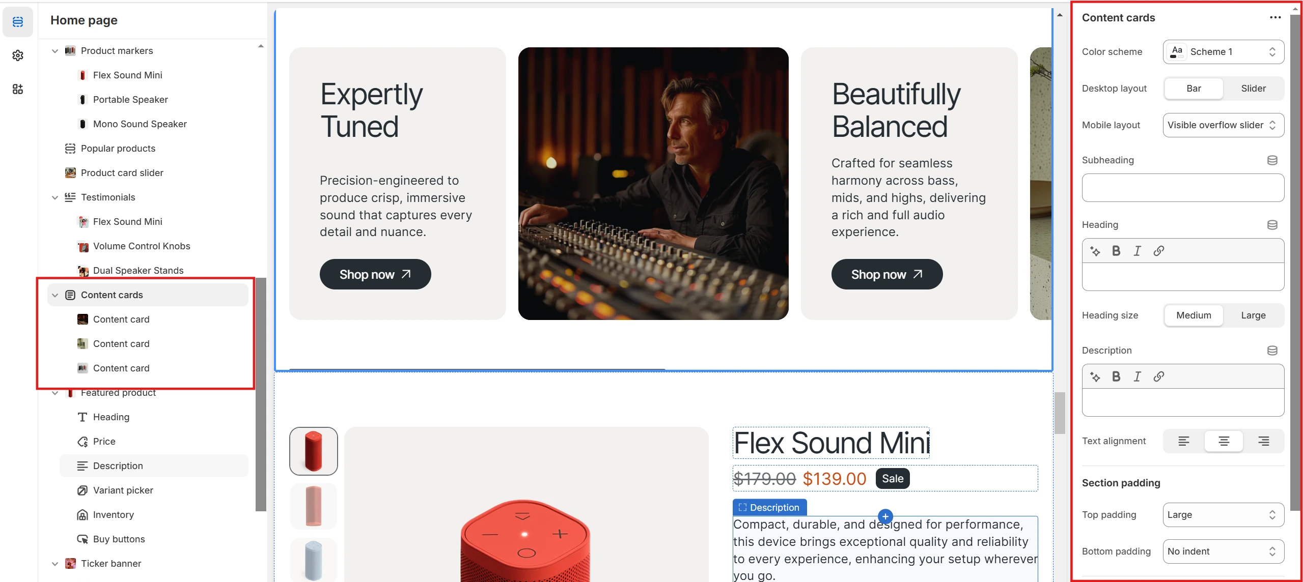
- The Color scheme settings allow you to customize the appearance of the whole section.
- Cards can be presented in two formats using the Desktop layout option: Scrollbar or Slider, with desktop cards being draggable via a dedicated floating Drag button.
- On mobile, the content is shown as a slider by default, but the Mobile cards layout option lets you switch between Visible overflow slider and Slider with arrows
- Text content, such as Heading, Subheading, and Description, can be adjusted along with Text alignment.
Cards are composed of two parts: a Text part and an Image part, each with its own customization options: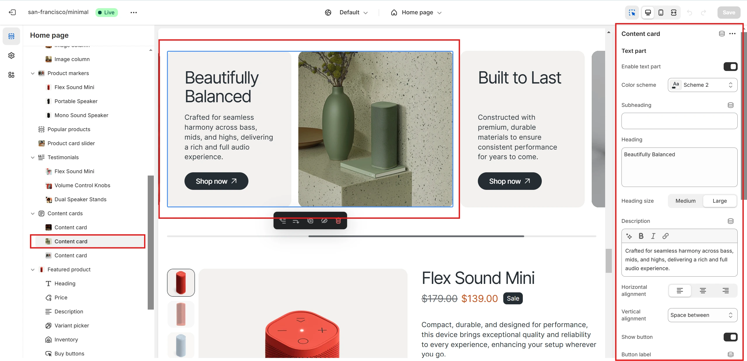
Both parts of the block can be enabled or disabled as needed. A specific Color scheme can also be applied to them.
-
Text part
- Text content can be added through the Heading, Subheading, and Description fields, similar to the whole section settings.
- A button with a custom link can also be included.
- Content placement inside the card can be adjusted with the Horizontal alignment and Vertical alignment options.
-
Image part
- The Display order option allows you to set the order in which the image part is displayed.
- You can add an image using the Image option and adjust the overlay with the Overlay opacity setting, if needed.
- Similar to the text part, a button can be added and linked to a specific page.
- If a button is added, its Horizontal alignment and Vertical alignment can be customized.