Banner grid
This section allows you to add a grid of cards with background image or video and texts.
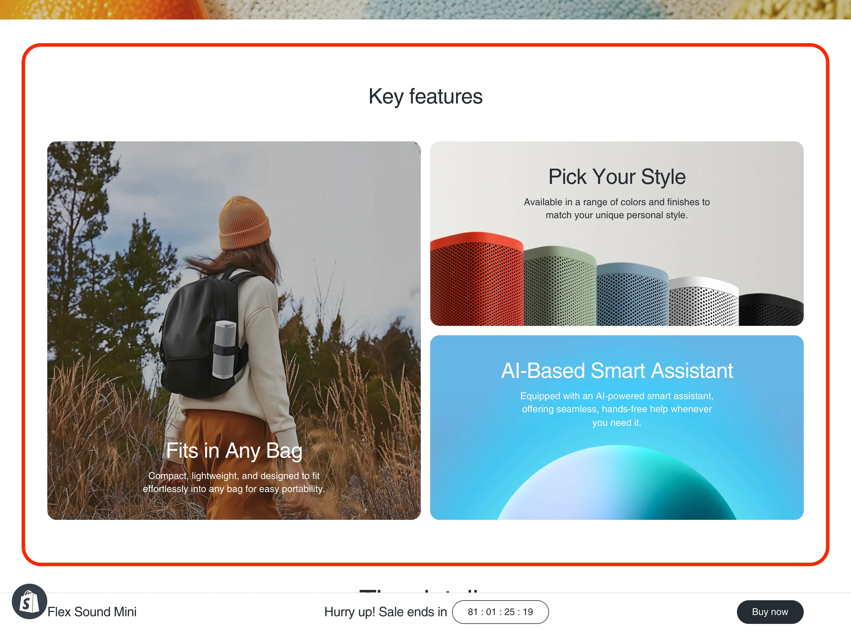
 In this example, the banner grid section has Grid columns amount set to 2 and Cards container desktop aspect ratio set to 2/1. First card has Column start set to 1, Column end set to 2, Row start set to 1 and Row end set to 3. Second card has Column start set to 2, Column end set to 3, Row start set to 1 and Row end set to 2. Third card has Column start set to 2, Column end set to 3, Row start set to 2 and Row end set to 3.

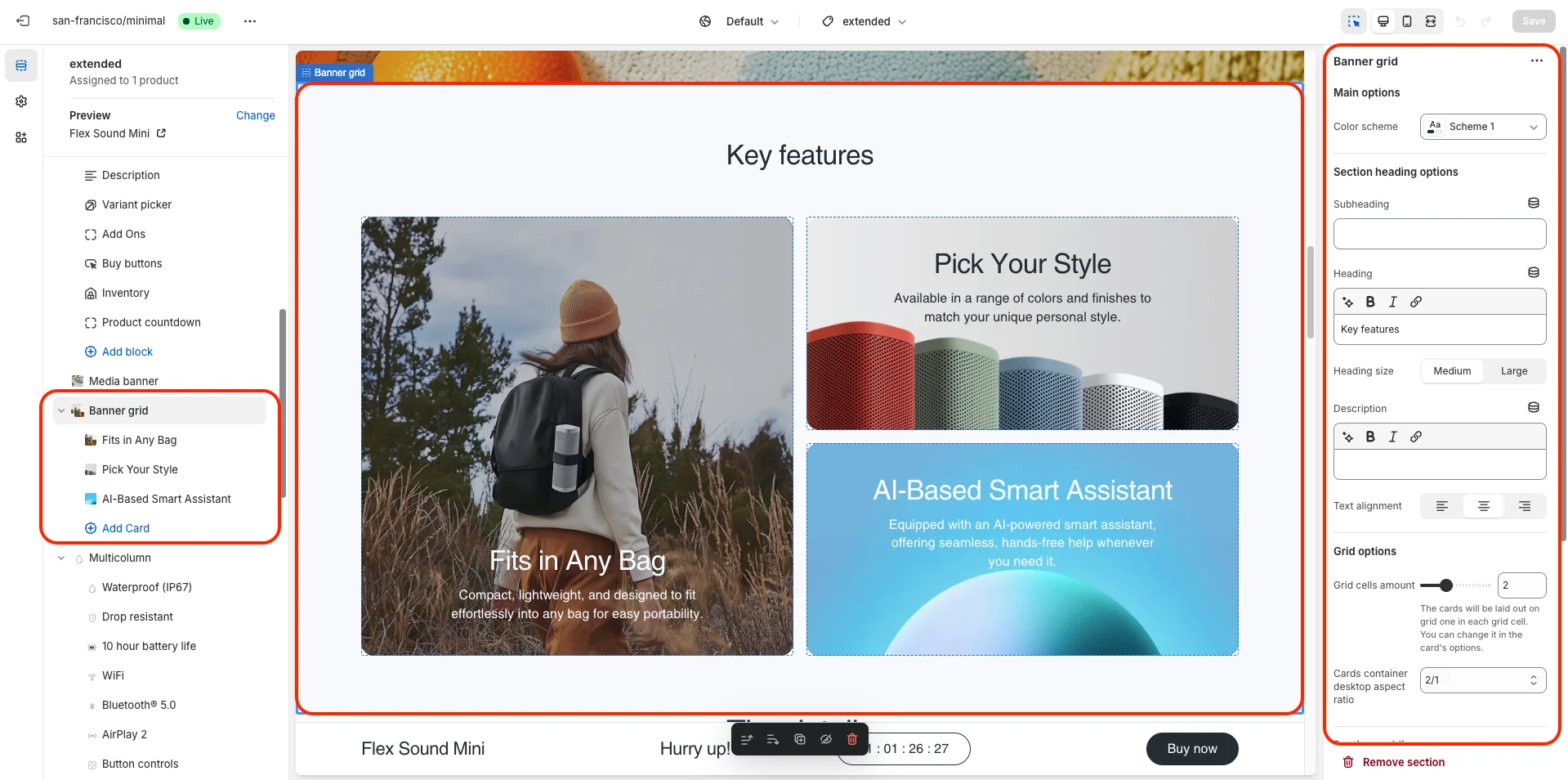
- Color scheme selector changes the color scheme for the section.
- Section heading options (Subheading, Heading, Heading size, Description and Text alignment) allows you to set a subheading, heading and description for the whole section.
-
Grid options allows you to customize grid layout. Includes following options:
- Grid columns amount – allows you to set the number of grid columns.
- Cards container desktop aspect ratio – allows you to set the aspect ratio of the whole cards container on desktop devices.
- This section contains one block type - Card.
Card options includes:- Color scheme selector changes the color scheme for the card.
-
Card postion options allows you to set the position of the card in the grid. Includes:
- Column start selector allows you to select the starting column for the card.
- Column end selector allows you to select the ending column for the card.
- Row start selector allows you to select the starting row for the card.
- Row end selector allows you to select the ending row for the card.
-
Image and video options allows you to set background image or video for the card. Includes:
- Background image allows you to set background image for the card.
- Video allows you to set a video for the card.
- Overlay opacity slider allows you to change the opacity of the overlay.
- Card aspect ratio on mobile devices allows you to set the aspect ratio of the card on mobile devices.
- Content options allows you to add a heading, description and button for the card.